W3- Website Banner Development
WEEK 3
PRACTICAL
The lecturer assigned the student to design the website banner that is a part of the assignment 1. He then mentioned about the name that students use for the website can register the domain for it. If the students are really seriously making the website for the future.
Improvement for the logo
I've add on logo above the logotypes and enhance the logo to be more modern, western and simple.
 |
| Previous logotypes |
 |
| Logo with 2 colours |
 |
| Logo black & white |
WEBSITE CREATION
PHOTOGRAPHS
Lecturer mentioned that it's good to use a high quality photos such as photo shoot in the studio or a photo with good lightning and composition. Due to the lack of photographs and I planned to go for studio photoshoot to get good photos that suits for my website banner style. That's the result below:

TOP 5 PHOTOS

Choose the top 5 of the photographs of ourselves in terms of clothes, colours and vibe that photographs present that determine the stype or atmosphere for our website.
FINAL CHOSEN PHOTO

REFERENCES
After confirmation of the photographs, finding the references that similar with our style that we want to do is essential when we start to design a website. The websites that inspired me are:

Observation on the placement for the photos and the texts and the depth effects as well as how the designers playing with neutral colours to make messages stand out.

Investigate in the website and clicking through all the button. Study on the UI and UX of it and the atmosphere, arrangemet, font, text, colours that can inspired me in my website.

Study for this website in terms of the composition and the how the designer playing with the contrast of the font size as well as the depth effect that creates.
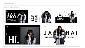
SKETCHES


DIGITAL SKETCHES

The wireframe in digital versiosn that can help me to see the rough feelings and the placement for the website banner
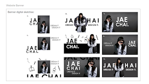
Explore more on the digital sketches helps me to know which design or placement is the most suitable for my website and help me to see clearly.

The wireframe in digital versiosn that can help me to see the rough feelings and the placement for the website banner


Explore more on the digital sketches helps me to know which design or placement is the most suitable for my website and help me to see clearly.
FINAL DESIGN
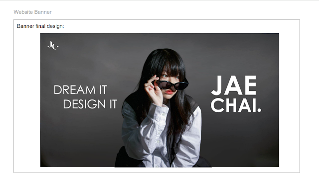
The final design for the website banner will be very simple, only for the header (name) and also the slogan beside my portrait and the logo will be placed on the top left corner to make sure the overall visual are clean and simple. The logotype itself will be separate to another page for the website design later. The reason why is because I don't want to make the website too complicated. Also, by extending the background for the photos, it creates a natural vibe and it won't look fake if photoshop the background directly or cut out the person.

The final design for the website banner will be very simple, only for the header (name) and also the slogan beside my portrait and the logo will be placed on the top left corner to make sure the overall visual are clean and simple. The logotype itself will be separate to another page for the website design later. The reason why is because I don't want to make the website too complicated. Also, by extending the background for the photos, it creates a natural vibe and it won't look fake if photoshop the background directly or cut out the person.
LECTURE
WEBSITE LAYOUT
The lecture discusses creating a good website layout, which establishes hierarchy, emphasizes key components, offers intuitive navigation, and enhances user experience. It includes elements like header, page body, navigation menu, footer, and layout types like single/two column, split screen, asymmetrical, and grid.
WEBSITE HEADER & & WEBSITE FOOTER& PAGE BODY
Website header is the element that catch the audiences attention at the first glance. What the audiences can get the message from the it at the same time. Not just only that, page body is also key of the website. It's a core section of the website that includes important text and visuals, which also means it's the description of the website (what message you want to deliver).


NAVIGATION MENU
The navigation menu is the buttons that can click in the website, it's important to guide the audiences and stimulate the audiences curiosity to look into the website. After that, website footer is a good place to put in the social media links to keep engaged with audiences and let the audiences take action to engage with us, it's a Call To Action (CTA) as well as the copyright notices and privacy policy.

LAYOUTS
Single column layout presents important messages vertically, utilizing white space for clarity and comprehensiveness. Two column layout divides messages into two vertical sections, allowing multiple messages to appear simultaneously, while maintaining a detailed and comprehensive appearance.

Split-screen layout is one of the interesting layout for creating a website. It's divided into many sections. When the visual and the layout designed well, it can creates uniqueness of the website. Moreover, split-screen layout are able to give the audiences different kind of scrolling experiences.

Asymmetrical layouts use photographs to create backgrounds, while grid layouts balance color contrasts and modularity, showcasing visuals and art in one interface, aiding in identifying dominant projects.


Comments
Post a Comment