W2- Logo Development
WEEK 2
PRACTICAL
During the second week of the practical session, the lecturer brief about the part 1 of the assignment 1 which is related to create a logo. The first thing that the students need to do is to find references for the logo. To know that what they want to do and what visual message that they want to deliver to the viewers.
LOGO & LOGOTYPES
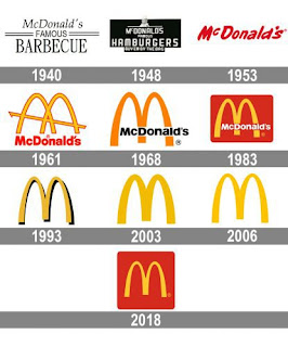
The differences between logo and logotypes is that logo representing the simplified icons, visuals and symbol. While the logotypes is about text. It's about the full name of the logo, a kind of description that describe the logo. Everything that relates to "types" that means typography in design. Lecturer used McDonald's as the example, the alphabets "M" is the simplified of the McDonald's. The first 10 years of McDonald's, they are not using just only alphabet "M" in their logo. They constantly renewing and evolving their logo.
Therefore, I have found a few references as shown below:
REFERENCES
This 3 typography have the similarity of the thickness of the font. This kind of typography can create a modern and clean vibe because they are all Sans Serif fonts. Moreover, they don't have any limitations on designing. They can fit nicely with every theme of the design.
RESEARCH SUMMARY
It roughly telling the messages that I want to deliver through my logo and the style and vibes I want to show in the logo and to the audiences. The 3 words to describe the logo is simple, modern and clean, these are the vibes I want to emphasized in my logo. Slogan is the things that is important, as for my slogan. I would like to tell people "Dream it, Design it". Dare to dream, dare to design it out, let it become true.
 |
ZOLINA
The first typography is Zolina. This typography give the vibe of clean and elegant vibe that that is suitable for the theme that I want to do for my website. Zolina is also playing with the thickness and the curve of the corner of the alphabets. The font family is good to use for both logotypes and slogan.
SHALLOTA
The second typography here is Shallota. Giving the same vibe with the first typography (Zolina) but it still have some different on it's tail and the tops of some alphabets that shows the uniqueness of this typography. It's a good choice for designing the logo or the logotypes.
SKETCHES
The first sketches are mostly rough sketches that draft out the brainstorming session about the logo and also the name that I wanted to put as my website name. The second sketches is more on choosing the styles that I like and sketching with the grid line that can helps when constructing the logo and it also helps when transferring the sketches to Adobe Illustrations.
VECTOR VERSION OF LOGOTYPE
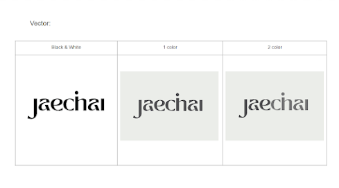
The final logotypes outcome are all using a very modern and cool colours to represent the cleanliness that I want to show in the logo. Moved the alphabets "j" and "i" to above alphabet "h" is shows the cleanliness of the logo. The gap of the alphabet "a" created a balance and harmony feelings as well as the thickness of the typography is creating the uniqueness and make the feeling not too boring.
Lecture
PURPOSE SETS THE FOUNDATION
In the lecture session, the lecturer explained about the 10 principles of web design. Which the first thing is purpose sets the foundation. The meaning of it is that, our designers have to know who is our target audience, what messages that the audiences want.
CONTENT GIVES MEANING & AUNTHENTICITY
The second principles of web design is content gives meaning, good content directs your audience towards the actions we want them to take and is clear, and helpful. The content also has to be authentic, that has no exaggerate the functions of a product or brand. It's what it's. Establishing the goal of your website will help us determine what kind of content we need, and using a content-first approach means starting the design process with actual content. SEO is a important thing to know because it can let our website easy to find, that's what can raise the exposure of the website.
VISUALS & VISUAL HIERACHY
Visuals are crucial for engaging audiences, requiring a balanced operation of both brains. Clean, high-quality visuals are essential for enticing viewers to explore a website. A user-friendly visual hierarchy is essential for continued engagement with audiences.
HARMONY & WHITE SPACES
Harmony is also one of the key of designing a website, it's also related with the next principles that the lecturer mentioned which is white spaces. Playing with white space can make a harmony layout or arrangement for the website. So the website won't looks messy, when things all compact together, it will looks uncomfortable for audiences or viewers. Thus, creating some white space is important to shows the harmony which let the design looks better.
TYPOGRAPHY & COLOURS SET THE TONE
The principles that cannot missed out is that typography and colours. Both of them shows the first impression for the audiences, it influenced the whole feeling of the website. Thus, choosing a suitable font and colours is important when designing to show the atmosphere and deliver the brand message at the first glance. Moreover, the content organization should be unifies. The content logic, flow and it should be fit into a hierachy. It also shows that left brain (logical thinking) is also important in design.
Almost the end of the class, the flip presentation started and told us about the favourite web designer that the group of people found and likes. Which we are also asking questions for them to answer.
During the breaks, the first group of the students started to present their favourite web designers' website. They shows some of interesting website that we can learn from it and it's interesting to getting know more of the web designers that we don't know. Moreover, the lecturer also shows some of his works that he done before so that we can learn from it too.


Comments
Post a Comment